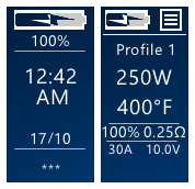
-
Posts
109 -
Joined
-
Last visited
-
Days Won
7
Content Type
Profiles
Forums
Downloads
Everything posted by niandra3
-
Ah it's tough.. everyone wants something different. Most people these days use either high wattage or TC (me included), so I never need like 42w, because 45w is close enough. I think 5w increment is a good medium.. unless you are vaping under 20w, there isn't really a need for smaller increments. And for me, 45 is a "straighter" number than 44 I'd recommend you can edit this very easily in the theme when you download it, before installing it just click Edit > Screens > Main Screen > click on the Watts on the main screen > click Options button on the right > change Step size. The options are 1, 2, 5, or 10.
-
@Atticfire I just released version 2.1 which addressed I think all of your concerns. I updated the battery icons so it's clear when it's charging or when the battery is low, the puff count can now be hidden via Main Screen Settings page (note that the puff count only displays in wattage (non-TC) mode, so if you hide voltage you also hide the puff counter). And I changed the Replay icons to NO REPLAY > SAVE > PLAYING as suggested. Great suggestions, thanks!
-
.thumb.jpg.a3824d163aeb0042604396f8cca596ce.jpg)
replay Mx2 (with Replay. Available in Green & Blue)
niandra3 commented on Tortuga's file in DNA 75 Color, 100 Color, 250 Color
-
@Atticfireyeah I stopped the battery icons changing color thing, to help support handling more wallpaper options. Currently only the battery percent number changes color. But I can change that back if it's important to you. I just wasn't sure if anyone used/needed it. But do you also mean you also can't tell if the battery is full or empty? That's definitely a problem. Good catch with the puff count on the main screen. That's a new thing I added for wattage mode and forgot to add an option to hide it. Thanks for the tips, these will all be resolved shorty with a new release. Edit: and yes I was already planning on changing the replay icon colors. They'll probably be grey and/or related to the color of the wallpaper (partially transparent like menu icon) Edit2: now that I think about it, I probably won't change the color of the battery icon, but I'll change the icon to make it clear if it is low or charging (with symbols). I want everything to be colorless more or less so different wallpapers can be used and not clash with the text or icons.
-
Awesome! Glad I could help.
-
Yep, I have a few that work for me and other people. The thing is, you need the latest INTERNATIONAL version of EScribe, the latest 75c firmware (1.1 SP33.2 works for me), and a profile in EScribe with Replay enabled. You also can't use a kanthal coil. These are my themes that are replay enabled and work for others (edit, the description of the first theme has more instructions if you click on it): If you need more help, let me know.
-
.thumb.jpg.a3824d163aeb0042604396f8cca596ce.jpg)
Maximum power setting via mod with dna 75c board
niandra3 replied to truckman's topic in Themes and Custom Screens
I don't think so. I'm pretty sure the way it stands now you need the International EScribe Version, and in there you can set the boost and raise the wattage max. Not sure if you need latest 75c firmware or not (usually worth it to upgrade that too) -
Ok for anyone following this thread: I have a new theme called Clean Colors. It is basically the same as this one (v1.9) except that there are some visual improvements and MANY options for color schemes. It's called "Clean Colors" and you can find it here. Please let me know what you think! I will leave these versions here and available to anyone who prefers them, but going forward I'll only be doing updates on Clean Colors. The BETA version I made here will be split into a new theme called "Blue Buttons" and released soon. Thanks!!
-
Are you using 75c? There's some specific steps you need to take to get replay working (International EScribe, right firmware, or course enabling Replay in the profile, etc). If you need help, I can walk you through it (it's my theme) edit: also go to the Replay Settings page in the menu and it will show you more info (e.g. if Replay is enabled/available with your current setup)
-
There's two versions, check the PLAINTEXT version on the download page (It's my theme.. some people didn't like the font so I made a second version). Works great with replay as long as you have right firmware, etc.
-
I haven't been following the posts as closely I guess. I had trouble getting replay to work because of firmware/software versions so I posted what worked for me. It's a really convoluted process so people need to know all the steps. But yeah, kanthal isn't the answer.
-
Thanks to @s3r for the review. I take it you were able to get the temp control stuff working? And I have actually removed the version number from the About page for that exact reason.. I knew I wouldn't remember to update it. Try the latest version if you haven't already. Some improvements have been made to replay and other stuff.
-
@Tortuga no I actually use it equally on my 75 and 250 so I tried to design it to support both equally. Bit since I use Temp control I never need like 12w or something like that. But I truly do appreciate the input... So many great ideas and fixes have come from this community so I'm really grateful. I'll keep you posted!
-
Wow thanks @Tortuga. You'd be surprised how many of those features were in earlier versions. I guess I got too focused on streamlining the main screen without thinking enough about usability. Look at DJLSBlab's theme and that was more or less my starting point. He did have an info button, and in my early versions percent was up top but coming from Android the menu button is usually up on the corner like that so I figured people would find it easier there. That being said you're definitely right. Version 2.0 is going to be a big update and I'll try to include as many of your suggestions as I can. Some of it is preference of course, but if I can make it more usable I'll definitely do that.
-
Or they're on a 75c device and don't have the International Escribe, or the right mod firmware, or Replay enabled in the profile, or etc. etc.
-
I keep asking them but they don't seem to have the time. They barely have documentation for EScribe, much less the theme designer. The video above is the best we've got so far. As I said above, I recommend finding a good theme and reverse-engineering it. The only tricky parts are the conditionals and hidden objects, everything else is pretty straightforward. Oh and you need some graphic design skills if you want to make your own icons and such. But yeah I agree.. it's a mess. And the UI isn't very well designed either so even with docs it would be somewhat confusing.
-
Version 1.2
1,146 downloads
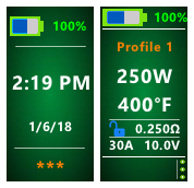
NOTE: I have a more up to date theme called "Plain and Simple" that now also offers a green-themed option. So if you want something minimal and simple, check that one out as well. It also supports TC, Replay, Wattage modes, etc.. it is just a bit improved over this one in a few ways I think. ---------------------------------------------- Mean Green v1.0 Highlights: This theme is green. That's about it (it's pretty straightforward). Supports REPLAY on 75c and 250c devices. See info below if you are having issues with Replay on 75c. You can seen screenshots below of what the Main Screen looks like in Replay mode, and what the Settings screen looks like when Replay is enabled (there's more options visible). Features: Lock screen: battery level, time/date (which you can hide) Main screen: battery level, wattage, temp (if in TC mode), voltage (if not in TC mode), profile, coil resistance, current, Replay on/off if enabled in your profile Settings: Replay info, units F/C, puff counter Display: brightness, stealth, time/date set, hide time/date ---------------------------------------------- Replay info: Latest version works with Replay for 75c devices. BUT you need to have the International Edition of EScribe 2.0 SP15.1 or greater. I also believe your 75c needs to have the right firmware as well (at least 1.1 SP33.2 - that one works for me), once you update ESscribe it should prompt you to update firmware for your device. You also MUST enable Replay in your EScribe profile for it to work. ---------------------------------------------- Let me know what you think! You all always have the best ideas for fixes and improvements, so don't be shy! Leave a review or comment below.. (even if you don't like it I need the feedback) Main Screen | Settings Page (when Replay enabled) -
You guys are right, sorry. Definitely kanthal does not work with Replay. But yeah mixing kanthal with other TC metals does work (just like normal TC). And apparently you don't have to tell the mod what the material is... no more TCR or anything.! (I always use "wattage" as material for Replay mode) I found the exact quote (useful info): https://youtu.be/Jac9au_1uY8?t=28m37s But again for REPLAY on a 75C, you need latest International Edition of EScribe (currently v2.0 SP15.1) and latest firmware on your mod (I use 1.1 SP33.2). Then you enable Replay in the profile. Then you go to that profile on your mod, take a puff, and the save button should appear. That being said, after trying it for a while I don't really see the appeal. It's just a slightly different implementation of temp control.
-
@Erwin Julian I would love to make that bigger, and it used to be, but if the profile name is longer than like 10 characters or so, then it won't fit on one line. Try it out. So I had to make the font small enough so it could split into two lines. If the font is bigger, then with a long name like "titanium" it would get all cropped out and wouldn't really be visible. But I did center it vertically in v1.9, so it at least looks a little better even though it's not any bigger. I might be able to re-arrange the main screen a bit though, we'll see. I'm constantly trying to make it better. I figured wattage/temp/voltage was the most important info since that's what you change most often (or I do anyway), so that's the biggest. Now that I think about it, I never use wattage mode so I haven't really spend a lot of time on that screen. I'll be sure to look into it for v2.0. For instance as you can see, voltage is displayed twice in wattage mode (in the middle and on the bottom right), which is clearly a waste of space. Anyway, thanks for the tip!
-
@Erwin Julian thanks man! I use this theme on my own Mirage.. in fact that's why I designed it since I didn't like the stock theme so much. Glad you like it! If you ever have problems or ideas for improvements, let me know here and I'll work on 'em! edit: it looks like you might be using an old version.. you might want to try 1.9 as its been optimized a bit in terms of visuals.


