Jump to content

Simple Dark (Boxer, Evolv, HCigar, LostVape, RebelVape, ThinkVape, Vapecige, ViciousAnt, Drone, Mirage, Paranormal, Therion, Triade) 2.0.4

   (4 reviews)

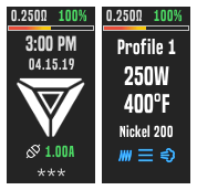
2 Screenshots

About This File

I welcome improvements, suggestions and errors.

Based on the original Evolv DNA Color theme.

-Added missing options and fields
-Standardized control size, spacing and location.
-Dropped the default background and replaced it with a solid color one.
-Adjusted the selection colors.
-Replaced some labels with icons to reduce clutter.

Lock Screens:

Boxer.png.cb8d5a772ca3be73f56d8d186475420d.pngDrone.png.6236f553b5e6f55a23b688a71c31ee79.pngEvolv.png.07662e8f3a1f6efda87478d4ec4d81a9.pngHCigar.png.62c9255e431acb84e357c79a6ee68c1c.png1908956992_LostVape.png.bc2f21bb42f7be47ef0acdf7f739b0c1.pngMirage.png.5c6eb1f6d504b4a536e492d6bf7a4aa9.pngParanormal.png.b2532f8332cdc6945e94b0621e609479.pngRebelVape.png.17c8d2cb4f9d86072ae08dc1c49e4cf1.pngTherion.png.d7d2f8fe287ca2761d5856e38771ca94.pngThinkVape.png.d58cbddc9a62d52a05bcd2764ee1c703.pngTriade.png.539c8693318c2191ab180a22f413e70a.pngVapecige.png.1ad906d82900cd6f4914d6254a22f463.pngViciousAnt.png.6fcab52c91207c947ce92e1b7c8de706.png


What's New in Version 2.0.2   See changelog

Released

v2.0.2:

-Improved 'Menu' screen and other small tweaks.

-Added 'HCigar' and 'ViciousAnt' variants.

  • Like 3
  • Thanks 1

User Feedback

Create an account or sign in to leave a review

You need to be a member in order to leave a review

Create an account

Sign up for a new account in our community. It's easy!

Register a new account

Sign in

Already have an account? Sign in here.

Sign In Now

Vapors Tongue

   2 of 2 members found this review helpful 2 / 2 members

like this theme very much nice and clear , nice colour combinations too - thank you

Response from the author:

Thank you for your kind words, glad you like it

  • Like 1
Link to review
Lanzarotechris

   1 of 1 member found this review helpful 1 / 1 member

Nice Theme, but I have some issues with it. I downloaded the Triade version for my device. I thought I give it a try as I like simple coloured themes and not the flashy ones ;-)

And black on a black triade is what I was looking for. But here are my issues with this theme:

1. It is hard to see which action is active/choosen when I use the up/down button (its depending on the angle of view, but in general I think its too dark to see it easily) Maybe the contrast should be more visible so users don't have to guess or take a long look and change the viewing angle to see. This may also be a safety problem if people have to look longer onto the device screen and miss what is happening around them) .

2. And correct me if I am wrong, but it seems there is no indication when the device is charging (except for the red pulsing LED under the main button of course)

I thought maybe the coloured line on top will maybe move, but it doesn't (which would be cool). So I can not see if my device is actually charging or not (so I don't know if it is connected to my PC via the USB either).

Would be nice if this can be fixed.

But in general I like it. So when the issues will be fixed you will shurely get the 5 star rating ;-)

Its nice, its simple, its clear, all information is available, and no pop-art graphics with hundreds of colours which makes most themes unusable for me.

Nice work !

Response from the author:

Hi, thanks for the review, it's very detailed.


1. Yes, i noticed this after i changed the colors, i'll be updating it later.

2. The battery 'bar' shows the battery level, is not animated as there is no way for doing that (AFAIK), but it will fill as the battery level increases. There's also the 'Indicator LED' on top of your screen that should be pulsating red-yellow-green each color fading from and to black when it's charging, plus the battery level at the top should turn green when it's charging and yellow when being used as a powerbank (I've attached a picture of this). Please let me know if this things i just pointed are actually working. Thanks!

Screen.png


EDIT: It is now updated to v1.0.5. Thanks again for your review.

  • Like 1
Link to review
zark

   1 of 1 member found this review helpful 1 / 1 member

Great theme for beginners. It is very bad that there are no settings before pre heating. Not conveniently located data about USB and battery. But I like it, very beautiful.

печать.PNG

Response from the author:

Thanks for the review.

Regarding Preheat/Boost/Warmth, they should be available (depending on your selected profile) in the 'Atomizer' screen, please let me know if it isn't.

Will look into finding a better place for the USB info.

  • Like 1
Link to review
×
×
  • Create New...