Jump to content

NEO Cloudz [on Crack™] {DNA250C + DNA75C} NP20

   (3 reviews)

2 Screenshots

About This File

This is the most advanced, feature packed vaping experience OR YOUR MONEY BACK!!!

Pick up your vape.

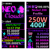
Have a taste of 2077, have some NEO Cloudz.

info.thumb.png.6f58f0290c47d453c8d2a5f3f9846705.png

HATE THIS???

Please fill in the following (very short) feedback form :) I would really appreciate it, especially if you DON'T want to download this. I want to make this better for everyone!

https://forms.gle/bSKWzHjmYJoyAmrE6

Do you think I have desecrated the holy sanctity of Frank?

This theme didn't used to be this hot 🥵. Think of this version as a spiritual successor to Frank's before, erghmm, it got hooked on all that... pink. Also check this for a more comprehensive change log :)

Neo Clouds On Crack has Frank at it's very core, hardened and sharpened until it's latest iteration. This.

Dev Style:

I'm a massive h*cking nerd if you couldn't already tell. This theme is themed after a computer terminal as that is where I spent most of my days. I love the minimalist high contrast look and wanted to bring that l33t l00k to not only to just my vape but YOUR vape!

A new version is submitted as I create them. While this means you will get extremely fast updates; this also means you *will* experience bugs and inconsistencies in the UI. Report them if you care. I am only human however meticulous I am.

Edited by Skit


What's New in Version v2.9.32   See changelog

Released

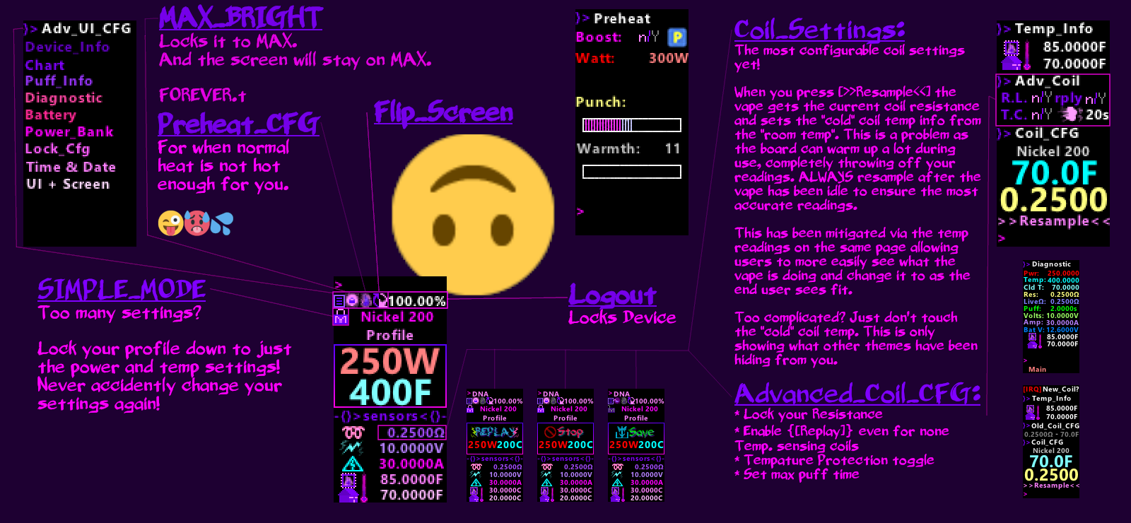
- Matched up colours for the chart on to the one displayed in the sub menu. Please comment if people think that I should match up the colours from the chart to the colours in the main UI. I don't think this should be done as the colours picked by the chart are frankly terrible and hard to tell apart. So I'll keep the rest of the UI as it is and people can refer to the trends settings page to view the colours for the chart. I've always thought the chart was way too small to useful to anyone anyway so it's not a big deal. None the less. It's no longer a problem :)

- Reverted colons on the puff info page as the information is displayed below the text and not next to it. This made it look weirder to me. The rest of the colons are happliy in their new homes :)

  • Like 1
  • Thanks 1

User Feedback

Create an account or sign in to leave a review

You need to be a member in order to leave a review

Create an account

Sign up for a new account in our community. It's easy!

Register a new account

Sign in

Already have an account? Sign in here.

Sign In Now

mactavish

   3 of 3 members found this review helpful 3 / 3 members

Not sure where to start, since Christmas has come and gone, but your Frank65 UPDATE is a great present!

FANTASTIC !!! This should be downloaded by everyone. I haven’t yet gone through every improvement, but you certainly did a lot of great work, and really must know Escribe and ThemeMaker. 

Screen flip, very useful, great use of colors, entire display much easier to read and navigate. LOVE the simple black background too, perfect. Not sure how to confirm any added accuracy you’ve added, but after reading your motivations for taking on this older great theme, and admitted OCD, I am 100% confident you’ve made everything better. Normally, when I write any feedback it’s more about fixing or improving negatives, but I have yet to find any, I’ll keep looking! :)

Hopefully folks will discover your MOST EXCELLENT theme and make it #1!

Only thing I have to investigate, is the screen timeout, it’s fairly short, don’t see a setting for that. Possibly something I have to reset in Escribe? I have the lock timing set for 30 minutes. 

Thanks again for this great gift!

Response from the author:

I've misread your reponse. It's in the lock settings, look for the key icon on the settings page.

Link to review
Schrode

   1 of 1 member found this review helpful 1 / 1 member

You know its a quality theme when the indicator light on the dna250c board isn't on constantly, I just got my dna250c this week so if I have to fix something on a theme that's a bad sign. Overall its a great theme. I'm a big fan of the colors, I really like that i can see the voltage of the individual cells on my lipo. I like that I can change the watt adjustment on the theme, I'd like to see .5 watt increments but it'd mess with the ui so I understand why it wasn't included. Now that I have it installed on my mod, it's good enough that I'll probably be to lazy to ever take it off. 

Response from the author:

I'd glad someone else is enjoying this theme. It still needs a bit of polish around the corners but life has gotten in the way.

It's worth a follow as I will update this eventually ;)

Link to review
zark

   1 of 1 member found this review helpful 1 / 1 member

Хорошая тема. Всегда уважаю людей, которые указывают автора разработки, которую изменяли!

печать.jpg

Link to review
×
×
  • Create New...