Skit
-
Posts
27 -
Joined
-
Last visited
-
Days Won
1
Skit's Achievements
Member (2/3)
17
Reputation
-
Theme Designers 'Top Downloads' panel - count spamming. STOP!
Skit replied to Wayneo's topic in Themes and Custom Screens
I agree with these points. This should be the way but unfortunately this is not how things go. People download stuff for a lot of reasons. Maybe it's for later, maybe they are like me and want to download a lot of themes fast so I can test them out. It's just quite a egocentric way to view the world. Other users who don't have an account cannot leave you feedback. This has lowered the barrier to review instantly so they don't have to give Evolv any of their details. I personally try to avoid giving out as much info as possible and wouldn't bother to make a account just to review a theme. You have to understand people don't just sit there and review themes. Especially if it's a hassle to make an account. -
Theme Designers 'Top Downloads' panel - count spamming. STOP!
Skit replied to Wayneo's topic in Themes and Custom Screens
I think this is a rather elegant solution as it not only gives us higher quality themes but also stops the spam. I don't think personally this should be the case. The user experience is going to heavily impacted via this method. Sure, one theme every 5 minutes is good enough for most users. But a new user who has just bought a DNA board would have to sit there for a long time before they could find a theme that suits them. I personally went through at least 5 before I found one that I stuck with for a while. That would turn a simple 5 minute browse into a long 25 minute waiting game. Furthermore, IP collisions are rare but do happen. Not just from the same household but sometimes large institution such as university or work place. It does happen. Some users may also use a VPN for a number of reasons, this would block them from using the website. I think this is a good idea but just impractical in practice. Perhaps only have the limitation for guests without an account? Even then I think it's bit too draconian to force a user to review something. We will only end up with pointless reviews and one word comments. Only via natural ways can you get real genuine feedback. If you want real change you must change the ground works and then it will follow naturally. I've gotten much more feedback since I added a google form to my own theme because I wanted real feedback. I didn't do by via raising the walls for everyone else and forcing them to before they could download another theme. I did so by lowering the effort taken to leave me a comment. -
Theme Designers 'Top Downloads' panel - count spamming. STOP!
Skit replied to Wayneo's topic in Themes and Custom Screens
Indeed. There is major rework needed to this forum! @Wayneo I know you have said you try to keep your hands off from the community but I don't think that is the way. In doing so you have lost the "human" bit to your moderator role. In doing so you are almost like a "deity" or "god" of some sort. Not knowing what the common humans get up to. I really think you should get more involved in the community -
Theme Designers 'Top Downloads' panel - count spamming. STOP!
Skit replied to Wayneo's topic in Themes and Custom Screens
EXACTLY! -
Theme Designers 'Top Downloads' panel - count spamming. STOP!
Skit replied to Wayneo's topic in Themes and Custom Screens
I'm very sorry about this. I've taken down the post as I can see why some users might see it as abrasive. That was not my intent. I'll try and rephrase what I've said in the original post here for everyone to see. I believe that the core issue in this problem is that devs are not getting the recognition they *think* they deserve and then turn to vote manipulation to do so. Unless your theme is *constantly* updated. And I mean ***constantly*** your post will be buried in a few days from the new panel. Not that even a lot of people will look in there, and even when they do it's a few downloads a day like you've said yourself. Certain themes have been in the top for far too long. Heck, the DEFAULT theme is on there. Can you try and understand why some devs would feel like they are getting slapped in the face? We literally don't ask for anything for the hundreds of hours of work we do, we don't ask for money, we don't ask for ANYTHING. And all that work get buried in a month never to be seen ever again by anyone. The ONLY way to get to the top is to fake stats or "update" your theme constantly. Fix the core issues, and people will naturally stop doing this. My suggestion is to have a weekly hand picked panel by the staff since you guys will be monitoring the posts anyway. This panel will not allow ANY post to go on there twice in a row. The core issue is that devs feel like their work is not appreciated and a system that actively buries and punishes new themes that are well polished (never needs to updated and therefore shown to new people)! -
Theme Designers 'Top Downloads' panel - count spamming. STOP!
Skit replied to Wayneo's topic in Themes and Custom Screens
While I agree with this as it would "fix" the problem it just makes it so that they will have to make an account for each download. This has more damage to a regular user than a bad user however. I don't think this should be the case. -
Theme Designers 'Top Downloads' panel - count spamming. STOP!
Skit replied to Wayneo's topic in Themes and Custom Screens
Yeah, I think this was a good way to notify the users affected. I don't think it would be fair to me and other users who have worked so hard to gain so much traction on their theme and yet to be just wiped. I feel gutted and I've only had my theme up for a few months. Please don't do this!!! -
Theme Designers 'Top Downloads' panel - count spamming. STOP!
Skit replied to Wayneo's topic in Themes and Custom Screens
"Attacker" is just a technical term for the person performing the action on your network. Well, penetration tester. It's just that when I usually talk about cyber security it's actually something serious and not a vape theme lol. Simplest solution would be to just remove the downloads. This should be done at least. The rest is up to you. I'm just some nerd who likes to vape. -
Theme Designers 'Top Downloads' panel - count spamming. STOP!
Skit replied to Wayneo's topic in Themes and Custom Screens
Na, it's fine. I didn't think you were trying to go after me for the review. I'm just putting it on the table to to be known. I think it's stupid and should not have even been possible at all. 1) Stop self reviews, should have never been a thing. 2) Just put a captcha on the download page. Simple drop in solution. 3) First log the CSRF keys and as much user info(such as user agent and IP etc. not sure if this is GDPR tho) as possible. Then after a week of (silent) surveillance change the keys to be ephemeral and unique by IP / browser fingerprint. If the bot is setup in a static way with static URL we will be able to immediately catch them upon the deployment of the new ephemeral keys. They will request a URL that no longer exists and then CSRF key can be correlated to a user request on the server. My URL for my download has been the same this entire time so if download links are per user and unique then perhaps the attacker has already revealed themselves. I highly doubt the attacker has made a fully dynamic bot for this. The IP, user agent and browser would probably be all the same. If it's not just a simple curl/wget loop since that works just fine without auth. HOWEVER. I should note. DO NOT BLOCK TOR OR VPNs. This is a stupid and a cop out way of "security", people actually need Tor and VPNs for things. They might not be able to even use Evolv products otherwise. Given a good system this sort of gate keeping is completely unnecessary and cuts out good users as well. -
Theme Designers 'Top Downloads' panel - count spamming. STOP!
Skit replied to Wayneo's topic in Themes and Custom Screens
>designers reviewing their own theme with a 5 star rating I've left one on my theme as a joke/protest. I agree with you. This should not be possible at all and just seems like a very silly oversight. You can see the reply I left to myself is "WFT, why are you leaving reviews on your own theme?". If you couldn't tell from my post I don't try to take myself or my theme very seriously. It's full of emojis and memes. Anyhow I did some testing and the current system is extremely easily exploitable. Even just clicking edit and then saving it immediately without ANY changes will work completely fine and will boost your listing up to the top of the new. I'm pretty sure a few themes are doing exactly this. That is before you look into actually performing an actual actual attack and not just clicking. You can see it's got a CSRF key at the end of the URL: https://forum.evolvapor.com/files/file/1196-neo-cloudz-on-crack%E2%84%A2-dna250c-dna75c/?do=download&csrfKey=7d443771196c5e0e5da05e71c005f365 But I don't think it's doing anything. You can just spam the URL and the downloads will go up. This leave it open to attacks via a simple CURL HTTP request or any type of simple net scripting at all. Which is to say if the attacker is competent and uses actual web techs like https://www.selenium.dev/ which can simulate full browsers... The forum is fucked basically. Anyhow, I don't think this will be fixed. It's simply not really a big enough issue for Evolv to fix. And to fix it it's not going to be an easy fix. It's a multitude of analytics and back end work. And even if it is fixed. It's a cat and mouse game. And we can't really point fingers unless Evolv digs up the server logs. Even then, it's hard to say who the culprit is since they can just spam other themes. RN, certain themes have far too high of a view / download ratio (I'm pretty sus, or maybe my theme is just bad idk lol). I think it would be very easy to filter out real from fake downloads given server logs. Fake downloads will probably just spam the URL and not bother to simulate user actions since it's not needed. BUT, in the case that Evolv does want to fix this I would love to help. I can code and would love to work for you guys -
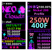
NEO Cloudz [on Crack™] {DNA250C + DNA75C}
Skit commented on Skit's file in DNA 75 Color, 100 Color, 250 Color
 Probably someone trying to cover their tracks by spamming. I'm not doing this.
 -
Version B0
265 downloads
Therion by Frank now perfectly pixel aligned and with UI redesigns; now easier and faster! Please leave a review (good or bad) if you download this I want the feedback. I spent a lot of time on this theme and would really love it if people can share and review this. The largest changes are: - Complete UI redesign with T H I C C text and C O L O R Z. Navigation has never been easier with the most important controls within 3 clicks of the initially highlighted control. - M O A R live readouts and more precision controls. - Much better coil settings that allows you to set the cold temp and material. - Fixed Replay, it now has power as well as temp. Use replay how you want! - New flip screen toggle on the main UI. - Pixel perfect and colour perfect! Meticulously crafted and aligned. - The Chart Settings page now reflect the colours on actually shown on the chart so users can refer to it as a key. Evolv plz let us change the chart colours manually ffs. Bugs: - There are absolutely none that I'm aware of. I've gone through all the menus with a fine tooth comb. My OCD will not allow me to rest. Everything down to even the decimal places are perfectly pixel aligned, colours are matched down to the exact hex codes. I challenge you to find a single problem. I'll wait. Why did I do this? I never planned to release this to the public or even make a theme but with Frank turning into VG and disappearing into the wind I found it to be my own personal mission to carry on the greatest theme ever made. Not because I thought I was worthy to do so but because how much it bugged me to use. I loved his theme. That's why I use it, duh. Some of you may have laughed when I said I spent a lot of time aligning stuff pixel by pixel but it's very obvious when you look for it. Bring up the thumbnails for Frank's theme and you can tell even without mine as a reference. Many of the elements are horribly misaligned and have random sizes from frame to frame. Switch between mine and Frank's quickly as tabs and it's even more obvious. This is just the visual aspect. Full Change Log: - M O A R C O L O U R and COMPLETE UI redesign. More colours to reflect what each text element is. - F A S T E R controls. While Frank did make a great theme I don't think they took into account the control position. Controls are now easier than ever to use with the most important controls easily accessible within 3 clicks from the initially highlighted control. - B I G G E R controls. Frank for whatever reason kept a lot of menus as small text. Text is now the largest they can be without distrupting anything else. - B E T T E R replay. The replay mode did not have coil power for whatever reason. This forced the user to set it up in EScribe or forever hold their peace. This is now no longer a problem. You can use replay however you want. - Flip display toggle. When using with my Dreamwood Glow I found it very helpful to quickly flip the display when using with glass. This is now easier than ever with the flip icon next to the battery instead of going into several layers of menus. - Higher precision output where it matters, axed where it doesn't. I have changed all the places where 4dp makes sense and applied it. This is most noticeable on the main firing screen where voltage and amps have are now 4dp. The original theme also tried to give the user higher precision but in the wrong way. Deltas of .1 do not matter that much (read: completely and utterly imperceptible) and just made it harder to navigate. It tried to fix this via giving the user .5 steps instead via a toggle. This theme now does 1C and 1W by default and then goes up to 5C and 5W with a toggle. If you don't like this you can easily just change it back to 1dp. The diagnostics page can also be used to dial in a precise temp and power down to 0.01 if need be. - Much better coil settings. The resistance now allows the user to set it up to 4dp as well as the cold coil temperature. This proved to be problematic as the resample button grabs the current board and room temps then uses the "room" temp for the cold coil resistance. In reality both of them *must* be physically on the board and are susceptible to heating up and noise. This is now no longer a problem as the user can see in detail the current board and room temps when setting up a new coil and are able to change the "cold" coil temp as they see fit. As a battery safety feature there is now multiple temperature read outs across all the screens. This should help make TC mode more accurate and safe by keeping the user aware of the board and "room" heating up. I know it was a problem for me when using my Dreamwood Glow as my mod would reach upwards of 55C on heavy long sessions. I suspect many users have constantly been getting far too hot and they didn't even know. The battery text will change colour with temp to indicate this with it turning full #FF0000 at 50C+. You should have done this anyway, but if you haven't by now; look up the data sheet for your batteries and make sure you stick to the spec. My P42As are safe up to 60C so 50C is a good enough warning for me. - Battery level colour change was based on battery voltage which only applies to single cell mods. Mods with more than 1 cell simply do not reach down to sufficient level leaving the code useless. This is now fixed to reflect the battery level instead so it actually works on multi celled mods. - Many MANY MANYYYY of the menus were horribly misaligned and not uniform. I went into each menu and matched the the size and position of each menu's controls. Many menu pages differed greatly in element size and positioning. For example the original split line asset was only 1 pixel thick. This means it was impossible to divide up the screen evenly. - MANY MANY MANY micro pixel alignments and offsets. Fonts render differently depending on how tall the chars are with chars like 'g' and 'j' reaching down lower and some letter reaching higher. Probably something someone would have never notice. Now I'm sure they never will as it doesn't exist I don't think I should have ever needed to do this. Evolv should change it to be constant. - Removed a bunch of pointless divisors and weird design choices. - Fixed assets, one of the back arrows were using a different asset as compared to the other ones. This back arrow was for some reason one pixel smaller than the other ones. This has been fixed so all the back arrows are the same. - Chart line colours are now matching with the Chart Settings so users can refer to it as a key. - Battery bank option has been moved into the battery sub-menu. The design just didn't make sense as the battery bank option was in the navigation bar on the settings page. This has now been moved to the battery section where it should have been in the first place. - You tell me, no seriously; I can't remember there are simply too many changes. Not pink enough??? Not enough features?? Check out my own spin on Frank's theme with even more features! -
NEO Cloudz [on Crack™] {DNA250C + DNA75C}
Skit commented on Skit's file in DNA 75 Color, 100 Color, 250 Color
Thank you my friend. I've noticed this as well. I have made several trades offs in my own theme in an attempt to make the UI look slicker. While it works great for me it doesn't work so well for new users. It's the top right corner for the rest of the settings. I think I'll be making a new graphic to explain the UI. You are correct in saying I may have gone too far. The style I've chosen has given up far too much for novice users. I plan to address all of these today and make the UI easier for a new user to use. The trades offs in this new "cool" look simply doesn't fit the use case of the vape UI and will need major step backs. -
NEO Cloudz [on Crack™] {DNA250C + DNA75C}
Skit commented on Skit's file in DNA 75 Color, 100 Color, 250 Color
Thank you my friend Stop by every now and then, I'll miss you 😢 -
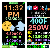
NEO Cloudz [on Crack™] {DNA250C + DNA75C}
Skit commented on Skit's file in DNA 75 Color, 100 Color, 250 Color
It's mostly purple lol, I just say pink as it's more provocative. Try it on your vape, you can always undo it. The new UI has lots of new features compared to the version B0. Granted I just finished it around a few hours ago so it's no where near as polished as version B0 but it'll be in a few days.