Jump to content

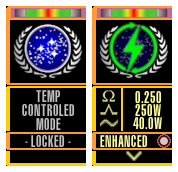
LCARS: 2 in 1 with the Federation banner or the DOTMOD logo

   (2 reviews)

2 Screenshots

  • Like 1
  • Thanks 1

User Feedback

Create an account or sign in to leave a review

You need to be a member in order to leave a review

Create an account

Sign up for a new account in our community. It's easy!

Register a new account

Sign in

Already have an account? Sign in here.

Sign In Now

zark

   1 of 1 member found this review helpful 1 / 1 member

Безусловно, очень серьёзная и грамотная разработка. Ставлю наивысшую оценку, но все же, мне кажется, что необходимо увеличить разрядность сопротивления +/- 0.001 это слишком грубо для корректировки вручную ( ИМХО).

В целом стиль, функциональность и удобство оценка отлично!

Печать.jpg

Response from the author:

I did it 😉

profile.png

Link to review
Gavnaf

   0 of 1 member found this review helpful 0 / 1 member

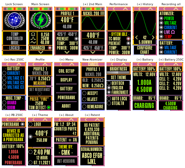
The settings that I put in one screen, to which you go by pressing one button, you made on three different unreadable screens, which you still need to get to. Very confusing menu, strange choice of colors, small print.
I am preparing a modified version of "Argus 2.0" where the same settings will be placed in one tab of the main screen. In my themes, I always try to make the interface as friendly and fast as possible, but you confused everything so that you yourself had to draw labyrinths in the description.

Response from the author:

It is interesting to hear your opinion.

Are you criticizing based on the screenshot (s) or have you installed the theme? I mean, the operation is quite intuitive once the principle is understood. Incidentally, I do not understand the criticism of the font size at all, you use smaller font yourself ...

The choice of color and font are based as closely as possible on the LCARS specifications. Maybe you should google "LCARS" to understand the graphics - then you will also recognize the effort behind this theme.

"In my themes, I always try to make the interface as friendly and fast as possible, but you confused everything so that you yourself had to draw labyrinths in the description." 

You should do the work to completely depict your own theme as a diagram - you would be surprised that it looks insignificantly less complex.

In short - I think you just didn't understand my theme.

Link to review
×
×
  • Create New...