
.jpg.9527f2e6bcf9bf52f823e3a88b8dc5af.jpg)
-
Posts
109 -
Joined
-
Last visited
-
Days Won
7
Content Type
Profiles
Forums
Downloads
File Comments posted by niandra3
-
-
Looking good man! Interesting idea for Replay, looks cool!
-
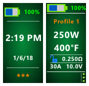
@Atticfireyeah I stopped the battery icons changing color thing, to help support handling more wallpaper options. Currently only the battery percent number changes color. But I can change that back if it's important to you. I just wasn't sure if anyone used/needed it.
But do you also mean you also can't tell if the battery is full or empty? That's definitely a problem.
Good catch with the puff count on the main screen. That's a new thing I added for wattage mode and forgot to add an option to hide it.
Thanks for the tips, these will all be resolved shorty with a new release.
Edit: and yes I was already planning on changing the replay icon colors. They'll probably be grey and/or related to the color of the wallpaper (partially transparent like menu icon)
Edit2: now that I think about it, I probably won't change the color of the battery icon, but I'll change the icon to make it clear if it is low or charging (with symbols). I want everything to be colorless more or less so different wallpapers can be used and not clash with the text or icons.
-
Ok for anyone following this thread:
I have a new theme called Clean Colors. It is basically the same as this one (v1.9) except that there are some visual improvements and MANY options for color schemes. It's called "Clean Colors" and you can find it here. Please let me know what you think!
I will leave these versions here and available to anyone who prefers them, but going forward I'll only be doing updates on Clean Colors.
The BETA version I made here will be split into a new theme called "Blue Buttons" and released soon. Thanks!!
-
Thanks for the kind review @CoxyofNewp. I'm here for you all! So if you have any problems/ideas/suggestions etc. please let me know here. A lot of the best ideas and improvements have come from you all!
-
 1
1
-
-
Thanks to @s3r for the review. I take it you were able to get the temp control stuff working? And I have actually removed the version number from the About page for that exact reason.. I knew I wouldn't remember to update it.

Try the latest version if you haven't already. Some improvements have been made to replay and other stuff.
-
@Tortuga no I actually use it equally on my 75 and 250 so I tried to design it to support both equally. Bit since I use Temp control I never need like 12w or something like that.
But I truly do appreciate the input... So many great ideas and fixes have come from this community so I'm really grateful. I'll keep you posted!
-
1
-
-
@Tortuga ah that one I won't budge on 😊
I use30-60w and I've never needed 33 vs 35. Plus I use temp control so wattage becomes less important. But maybe I can release two versions if others ask for it.
-
Wow thanks @Tortuga. You'd be surprised how many of those features were in earlier versions. I guess I got too focused on streamlining the main screen without thinking enough about usability. Look at DJLSBlab's theme and that was more or less my starting point. He did have an info button, and in my early versions percent was up top but coming from Android the menu button is usually up on the corner like that so I figured people would find it easier there.
That being said you're definitely right. Version 2.0 is going to be a big update and I'll try to include as many of your suggestions as I can. Some of it is preference of course, but if I can make it more usable I'll definitely do that.
-
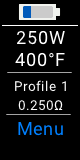
@Erwin Julian I would love to make that bigger, and it used to be, but if the profile name is longer than like 10 characters or so, then it won't fit on one line. Try it out. So I had to make the font small enough so it could split into two lines. If the font is bigger, then with a long name like "titanium" it would get all cropped out and wouldn't really be visible. But I did center it vertically in v1.9, so it at least looks a little better even though it's not any bigger.
I might be able to re-arrange the main screen a bit though, we'll see. I'm constantly trying to make it better. I figured wattage/temp/voltage was the most important info since that's what you change most often (or I do anyway), so that's the biggest.
Now that I think about it, I never use wattage mode so I haven't really spend a lot of time on that screen. I'll be sure to look into it for v2.0. For instance as you can see, voltage is displayed twice in wattage mode (in the middle and on the bottom right), which is clearly a waste of space. Anyway, thanks for the tip!
-
@Erwin Julian thanks man! I use this theme on my own Mirage.. in fact that's why I designed it since I didn't like the stock theme so much. Glad you like it! If you ever have problems or ideas for improvements, let me know here and I'll work on 'em!
edit: it looks like you might be using an old version.. you might want to try 1.9 as its been optimized a bit in terms of visuals.
-
@s3r thanks for pointing out the version thing, I have it fixed for version 1.9 which is coming soon. This is why I need all you guys!

-
Hey all, thanks again for all your support making this theme the best it could be. I'm going to keep working on it (in fact, v1.8 is around the corner), but this theme throws in everything and the kitchen sink. So I wanted to make a second theme that is much simpler. Maybe for your friend who is new to vaping, or your grandma, or anyone that just likes things simple. It's got the same architecture as this one, just pared down (a lot). Here it is if you're interested:
https://forum.evolvapor.com/files/file/512-plain-and-simple-75c250c-wreplay/


-
1
-
-
@Ronbon172 thanks, you have actually been a big help and have found a number of bugs for me, so I'm grateful. As for this counter, I'm going to leave it in the theme for now since it might be useful info for some people (I like knowing how many times I've reset the data, but that might just be me). But I'll redesign the page in such a way that it makes it more clear what the reset number represents. Thanks!
-
Thanks @hawk256! Yeah i think it is at a pretry stable place at this point. The stats thing is a non issue, just miscommunication (though there is a small error I'll fix soon). Thanks for your guidance!
-
@Ronbon172 though you have just pointed out another bug, the puff Time is incorrect (looks like it's set to puff energy). THAT I can definitely fix in the next release.
-
I tried to add a label there to make it more clear, but there isn't a lot of space. I'll move stuff around in the next version, so there isn't any confusion.
-
@Ronbon172 lol i feel like I'm going insane.
Ooooooooohhhh I think I finally get it.
That bottom number next to"Reset" is not supposed to be a puff counter. It counts how many times you have reset the stats. The puff counter is the number up top, directly under "puffs" . They should be two different numbers.
Is there something else wrong with the reset counter (that bottom right number)? For me it increases by one each time I reset the Current stats, which is how I designed it. Do you want it to behave differently?
Sorry that I misunderstood you for so long

-
@hawk256 I don't know if you get notified automatically or not, but I just pushed out version 1.7. I liked your suggestion about the replay on the main screen so I totally revamped it in this version. It's not exactly the same as the default theme, but I think it works well (and is possibly a cleaner look). Let me know what you think if you give it a try. Thanks!
-
Oh yeah, I got it now. Thanks!
-
1 minute ago, hawk256 said:
Thank you for putting in the hard work. It's easy for me to say I want this or that when I'm not the one having to figure it out, LOL. Wattage increment is such an easy thing to fix in theme designer, it really shouldn't be an issue for you to worry about.
Replay is a great thing from the usage perspective but does seem to be a pain to get it formatted for a clean look in theme designer. As good as you have done with this theme so far, I have no doubt that you will get the Repaly screen looking as clean as the rest of the screens you have designed.
@hawk256 do you know if the official theme you are talking about is available for download? I don't think I could find it in Theme Park apge.
-
@hawk256 thanks for the feedback! that's how I make the theme better.
I've heard people ask for higher AND lower wattage increments, so I figured 5 was compromise that most people could live with. I'm also a low-ish wattage vaper (usually 30-40w) but I never find the need to dial in like 33.5 for instance rather than 35. But I also use temp control so that's makes the exact wattage less important. But I could see how it becomes important if you are vaping at like 12w or something.
As for replay..sigh.. I'm working on it. The theme designer is tricky when you've got a lot of stuff that is being hidden on a screen (e.g. hiding the Replay stuff when not in that mode). But I hear you, and I'm putting your request at the top of my list. The next release (today or tomorrow) should be much better in that regard. I also feel like I want to improve on the default theme's implementation, but you're right, as it is now, theirs is definitely cleaner. Anyway, thanks again!
-
@Ronbon172 sorry I just want to confirm so I can get it fixed. The latest version posted at the top of this page (v1.6) the reset isn't working on the Current Stats page? I tested it just now and it works for me. Again due to Evolv the total stats can't be reset.
-
It's working in my v1.6 posted above today. Is that not working for you?
21 minutes ago, Ronbon172 said:here is your latest file with puff reset and counter working.
-
@Ronbon172 I truly do appreciate the help!!


Clean Colors (75C/100C/250C w/Replay - Many colors available)
in DNA 75 Color, 100 Color, 250 Color
Posted
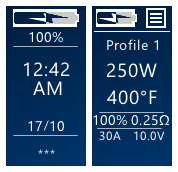
@Atticfire I just released version 2.1 which addressed I think all of your concerns. I updated the battery icons so it's clear when it's charging or when the battery is low, the puff count can now be hidden via Main Screen Settings page (note that the puff count only displays in wattage (non-TC) mode, so if you hide voltage you also hide the puff counter). And I changed the Replay icons to NO REPLAY > SAVE > PLAYING as suggested. Great suggestions, thanks!