Jump to content

Evolv default Landscape PIMPED OUT - SESSION MODE

   (6 reviews)

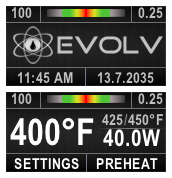
2 Screenshots

  • Like 4

User Feedback

Create an account or sign in to leave a review

You need to be a member in order to leave a review

Create an account

Sign up for a new account in our community. It's easy!

Register a new account

Sign in

Already have an account? Sign in here.

Sign In Now

Cadstar

   3 of 3 members found this review helpful 3 / 3 members

Absolutely my favorite theme, and I think I have tried every single one on the site. There are many great themes here but being an older guy most of them are hard for me to see clearly. I love the huge battery bar on this theme. Many others use color in power status, but even then just going red when power is say 15% or lower is good but it doesn't show me the difference between 15% and 8% very well. I would still need to bring the device closer to my face and squint which just makes me feel old.

I am just a wattage guy so I don't use a bunch of the more advanced stuff like temp and replay, plus I really like seeing a logo on the screen. I have a Thelema and it is my first really nice high-end mod although I have been vaping for a good 8 years now. It's the best investment I have made and wish I had done it a long time ago, I don't have the urge to buy a new mod every couple weeks anymore. Theme customization was one of the biggest reasons I finally went with an expensive mod so I am still here several times a week looking to see what is new, but I always come back to CMK's landscape, it has everything I need and feels comfortable to use. It's clear to me just how much time and effort was put into this and I appreciate it so much! Thelema is a great mod that wouldn't be half as good without the DNA250, and for me the DNA250 wouldn't be nearly as satisfying to use with this theme. Thank you CMK!

I would love to see a version with the Thelema name and it's logo substituted for the default Evolv would be great. I's pick the brown color if CMK chooses to add that variant for me. I liked the LostVape landscape but that one didn't carry on past version 7.4. I really dig the Thelema logo and its close to the Evolv one already, but I looked at doing this myself and found theme designer more complicated than I expected. I'm a tech guy and do linux bash scripting for remote server updating for a living but I can't seem to find where to just substitute one logo for a different one. Maybe that is by design? It gave me a headache so I figured I'd write up a review and ask. Thanks!

Response from the author:

Hi - thank you very much for your feedback!

I hope the version meets your expectations

Landscape#1_ THELEMA-brown_V9_SP55-or-higher.ecigtheme

  • Like 1
Link to review
Podunk Steam

   1 of 1 member found this review helpful 1 / 1 member

Before I go too far, this is from a Linux perspective, LMDE6 running SP57 on this system in conjunction with a DNA 75C.

So far "day2ish, a couple of hours of total tinkering", I've found this theme to be slightly counterintuitive with the Xs and Checks of the indication boxes but easily comprehended and adapted to.

I've managed to make a few adjustments for the old aging four-eyes, with adjustment texts switched to red text and adjustment highlights in a brighter shade of green than the near matching blue to the black background.

My only real shortcoming with this very well-prepared and configured landscape theme is my inability to add decimal incremental adjustments to the profile screen itself in the theme designer. Could be a Linux glitch, I really haven't dabbled enough to know all the ins and outs. In the atomizer screen, I have managed to add the decimal integers, so the functionality is in place for my oddball MTL wires being used for direct lung vaping.

Outside those few points, this theme is by far one of the more appealing themes I've used, without question, and I've been through more than just a few. Excellent use of space allotted with bold texts, wide scope of functionality and visually appealing.


  • Thanks 1
Link to review
BMan1959

   1 of 1 member found this review helpful 1 / 1 member

Very well done! New users should pay attention to the warnings about modifying anything as unintended consequences can occur. It's nice to see a new approach to the user interface without overcomplicating anything and this one fits the intended purpose. Thank you and again very well done.

Response from the author:


  • Thanks 1
Link to review
Wayneo

   1 of 1 member found this review helpful 1 / 1 member

This theme is just what the doctor ordered for my old tired eyes. BIG numbers I can read without my glasses👍👍

All the features you need, not all the features there are. Replay works as expected. TC works as expected. Descriptive warnings.

(Disclaimer: I have been testing this theme before it was released)

  • Like 1
  • Thanks 1
Link to review
Phone Guy

   1 of 2 members found this review helpful 1 / 2 members

Which one is the BROWN THERION? With the gold text? there is a brown, and a therion, not a brown-therion.  Neither of the other 2 show as having gold text?

Response from the author:

Hi, I apologize for not being self-explanatory when naming the themes.

ONLY the "Therion" theme has the golden text. In addition to the basic color brown, it also has its own graphic in the background.

WP1-dust.png

Basically, I can make you almost any color combination with almost any graphic.

I also have a silver version with the "Vapor Giant" logo on one of my mods...

Giant_LS.png Giant_MS.png

Link to review
BigLarry


A great theme for landscape fans. Many functions, easy to read, & an asset to the community all around. 

  • Thanks 1
Link to review
×
×
  • Create New...