

-
Posts
482 -
Joined
-
Last visited
-
Days Won
49
Content Type
Profiles
Forums
Downloads
File Reviews posted by CMK
-
-
2 weeks ago I didn't want to write any criticism and only praised the porting to the landscape format. In the meantime there is so much personal contribution in design and function that I HAVE to rate the theme - 5 stars, no question.
I have to acknowledge that themes don't have to be foolproof at all costs and there are also theme developments that require some personal responsibility from the user (combined Replay / TC) - although I also have to say that I based this rating on the description (and my poor knowledge of English) because I don't have the time for a deeper analysis at the moment.
-
 1
1
-
-
An interesting approach - even though I'm not a fan of defining the "main screen" multiple times within a theme. In the previous themes, I found it a bit more elegant to select the color directly without going through an additional screen.
I deduct one star because the basics of the theme are taken from an existing theme, which offers scope for incorrect settings (material change without control of the operating mode, so the TC mode remains active with non-temp-sensing material) - this one However, the problem affects ALL themes that allow changing the material within a profile.It is up to us to point out incorrect, impermissible settings within our themes.
I hope you're not too disappointed with my 4-star rating, but I'm really not a fan of 5-or-none ratings - a thumbs-up/thumbs-down would also suffice. With all the rubbish, I've actually given up on writing anything at all, with a few exceptions - in both directions 😉 and I like the enthusiasm with which you continue to pursue your idea 👍🏻
-

Ein Stern, weil weniger geht nicht.
Okay, jedem das seine, aber für Silicon im Briefmarkenformat muss Mann schon ganz schön fertig sein - ungeachtet irgendwelcher political correctness...
Abgesehen davon kein Mehrwert, die für die Bedienung relevanten Informationen sind kaum zu erkennen. Wieder ein Griff in die Kloschüssel mit einem "tollem" Wallpaper unter Missachtung jeglicher Nutzbarkeit.
Es tut mir leid (nein, eigentlich nicht), aber mich nerven diese ewigen Wallpaper-Themes schon lange, wo jegliche Grundlagen einer Usability ausser acht gelassen werden, kein Mehrwert für den User - Hauptsache, was veröffentlicht. Fehlt jetzt eigentlich nur noch ein big dick oder giant pussy lips... - Wobei, dafür ist dann vielleicht doch das Display zu klein.
-
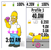
- One of the few themes that I actually installed - it made me curious.
- It is easier to read on the mod than initially expected (at least in a closed room without daylight): I think you invested a lot of time in choosing the color.
- A very unique design.
- Very interesting detailed solutions, I would like to highlight the profile selection and the setting of preheat / boost punch.
- Performance setting also possible during replay, great.
- Functional scope actually tailored to the 100C (75C).
- No experiments: by not choosing a material within the theme, you stay on the safe side.-
1
-
-
Great graphics in the background! Very nice, very detailed, but not dominant - the actual contents of the screens remain legible; very nice
-
Great graphics in the background! Very nice, very detailed, but not dominant - the actual contents of the screens remain legible; very nice
-
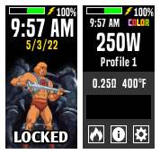
WONDERFUL GRAPHICS ON THE LOCKSCREEN 👏
-
1
-
-
For all fans - here is the theme with REPLAY !!!
After all, it's the year 2021 ...: -
Nice CLEAR design, no useless gimmicks - a real win
-
"... check that he's OK with the release, as the CC licence he chose restricts adaptations..!"
Zumal SirTimmyTimbit im Theme direkt als Autor genannt bleibt, obwohl es verändert wurde - dazu braucht es explizit sein OK.
-
Kaum zu glauben, dass dieses Theme mittlerweile fast 4 Jahre alt ist - es ist in seiner Erscheinung absolut aktuell und wird auch von vielen Usern als Basis für eigene Interpretationen genutzt.
Ich spiele selbst mit dem Gedanken, Elemente zu übernehmen 💕
-
Wenn auch mit Verspätung, so möchte ich es doch begrüßen, dass der Ansatz, alternativ ein stark reduziertes Theme anzubieten, auch von anderen verfolgt wird. (Kant hätte seine Freude - auch er liebte Schachtelsätze)
Sehr konsequent finde ich den Schritt, auf TC gänzlich zu verzichten; vielleicht solltet ihr darauf hinweisen, dass VOR der Installation sichergestellt wird, dass TC in allen Profilen deaktiviert ist. Eine Frage stellt sich mir in diesem Zusammenhang dann doch: wenn kein TC, wozu dann die Materialauswahl? Vielleicht wäre das eine Möglichkeit für die Zukunft; Wenn TC bereits aktiviert ist, die Möglichkeit zum Abschalten und im Anschluss "verschwindet" der Schalter. Gleiches für die Materialauswahl - mit der Umschaltung auf "Watt" blendet sich der Schalter aus. Konsequent auf REPLAY ausgerichtet.
-
Sehr hübsch und EIGENSTÄNDIG (!) - steckt viel Arbeit drin und man sieht, dass Du Dir wirklich Gedanken über die Bedienung machst, stetig Erfahrungen aus der Anwendung einfließen lässt.
-
Nice development 👍
-
Wenn auch etwas verspätet, so möchte ich Dich doch noch willkommen heißen 😉
Was mir gefällt an Deinem Theme:
- Kontraste! Du achtest auf die Lesbarkeit und verzichtest auf effekthaschende, bunte Bildchen im Hintergrund - weiter so!
- Du bemühst Dich offensichtlich, über alle Screens eine einheitliche Einteilung/Zeilenhöhe einzuhalten, was ich bei sehr vielen Themes hier im Forum vermisse 👍
- Du hast "nicht einfach nur" ein bekanntes Theme mit eigenem Hintergrund versehen, sondern Dir scheinbar wirklich eigene Gedanken gemacht (wobei mir die Trennlinien schon bekannt vorkommen 😁 - alles gut!)
Was mir auffällt:
- im Display-Screen scheint ein Darstellungsfehler zu sein (24h)
- persönlich würde ich die untere Navigationsleiste auf eine einheitliche Höhe setzten, auch wenn dadurch leere Bereiche oberhalb in einigen Screens entstehen
Alles in allem ein vielversprechender Anfang. Habe jetzt mein Urteil nur nach dem Screenshot abgegeben, ohne das Theme herunterzuladen, bzw zu installieren. Ich gehe aber davon aus, Du hast es hinreichend getestet...
Wenn Du mal Fragen zu "etwas komplizierteren" Detaillösungen hast, scheue Dich nicht, diese im Forum zu stellen.
-
Schön, mal wieder was in deutsch zu sehen, noch dazu mit neuen (?) Grafiken 👍
Die Funktionalität selbst habe ich allerdings nicht getestet... 😬 - kann den Theme Designer nach meinem letzten Marathon nicht mehr sehen 😒
-
Normally, I'm not a fan of "real" background images in the menus because legibility suffers - but here the wallpaper is chosen or edited to keep the fonts easily recognizable. Good work 👍
-
1
-
-
very cool 👍
I like the way to keep it simple ... When I look at the other themes (and especially my own) I see far too many things that are almost never used, so I've already started on one Theme to work, which combines both requirements - simple AND expanded. Your theme: great work, great graphics


V1.4.2_ecigtheme.7b336c00b202a6352d2ec2d6aa54219e.png)


Landscape Color
in DNA 75 Color, 100 Color, 250 Color
Posted
Very complex and very detailed graphics for everyone who would like to have it bright and colorful. No gimmicks with background images, all legible - good work.