About This File
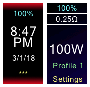
I wanted a theme that was easy to read in most lighting conditions. I wasn't going for something kick-ass, cool or pretty. I just wanted to see the stuff on the screen.
I changed the font, changed the colors for some of the text and highlights. I moved a few things around, and changed some names to protect the innocent from eyestrain.
I put this together in a few hours, starting off from Jason Villamil's 'Enhanced Default Theme'. I'm probably going to do some more tweaks to this but it should work alright now.
Please double check my power or temp settings before using an atty. This was made on an HCigar VT75D.
If you like it, or hate it bit have constructive criticism, please leave a comment.
EDIT (2019-03-21)
The 8 profiles on the device are set as follows: Watts 1, Watts 2, Watts 3, SS316, SS316 +, SS316 ++, Nickel 200 and Titanium.
I only use Kanthal and SS 316 coils, so I kept Ni200 and Ti as it was from stock.
Adjust temp or watts by moving the highlight up or down to the desired segment, and hitting middle select button. (the watts or temp will turn GREEN so you know it is in up-down adjusting mode). Tap up or down until you are where you want, then hit the middle button agian to set the temp / watts.
If you STILL cannot adjust temp, please reply below.
NOTE: the text in sub menus is VERY tiny. I will need to work on this some more. The main screen is easy enough to read, but you will have a tough time with the diagnostics.


