About This File
About:
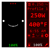
-Simple clean style, focused on practicality and clean design, allows replay mode
-Few well organized colors: Red = Default/Selectables, White = Non-Selectables/Charging, Blue = Errors/Selected, Green = Successes
-Probably great for red-green color-blind people (although I'm a trichromat so not tested)
-Well-organized and standardized, pixel perfect layout
-Mono-spaced (non-kerning) font for stable number fields
-No complex images, all images matching the style of the layout
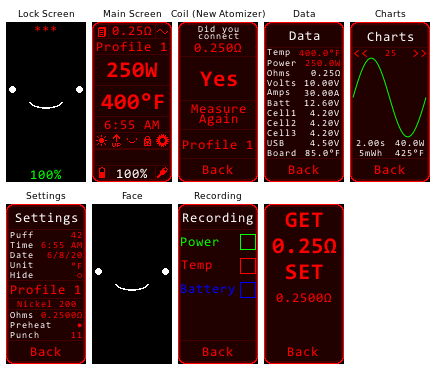
-No Settings Selection Menu - Other screens have been merged to fewer and directly accessible from the main screen
Lock Screen:
-No stats (Focused on clean looks, as we already have times and dates everywhere like phones)
-Cute BMO face. We are less likely to lose things with a face on them. (Also in the face mode where firing is allowed)
-Face colored with "Battery Status Color"
Main Screen:
-All red except error messages (red doesn't blind you in darkness, and makes the blue stand out)
-All features of a default main screen plus the features listed below
-Whole unit increments above 30W (0.1 increments above 30W in Settings Screen)
-Time field that changes to a fire timer when firing (And acts as a goto button to Settings Screen)
-Top-Left Corner = Data (Diagnostics) Screen
-Top-Right Corner = Charts (Puff Info) Screen
-Bottom-Left Corner = USB
-Bottom-Right Corner = PC USB
-Brightness Setting is on the Main Screen
-Status text on the bottom, above Battery/USB status line
-Battery Charge is colored with "Battery Status Color"
Battery Status Color:
-Red = No Status
-White = Charging In Progress
-Green = Charging Finished
-Blue = Power Bank OR Low Battery
Settings Screen - System/About/CoilInfo screens merged into one
Data (Diagnostics) Screen - Same as default, Added Cell1/Cell2/Cell3 charge, 0.1 increments of Power/Temp
Charts (Puff Info) Screen - Same as default, Puff Index Field -> Recording Screen
Recording Screen - Same as default
New Atomizer Screen - Same as default
What's New in Version 1.1.4 See changelog
Released
-Changed the iconbar a little


Recommended Comments
Create an account or sign in to comment
You need to be a member in order to leave a comment
Create an account
Sign up for a new account in our community. It's easy!
Register a new accountSign in
Already have an account? Sign in here.
Sign In Now