-
Posts
19 -
Joined
-
Last visited
-
Days Won
3
Content Type
Profiles
Forums
Downloads
Everything posted by SinisterCabbage
-
I've been toying with the idea of using 1 watt increments cause it'd be better for myself as well. I left it that way because I wanted the theme to appeal to more people. And I know you can go into eScribe and change it yourself About the battery icon, I actually made the battery icon in 256x256 cause my plan was to make it huge on the lock screen. Unfortunately whilst the DNA 250/75c is the finest chipset ever made the one thing Evolv messed up on was the amount of memory for themes. Pictures eat the memory and a half screen size full colour battery would actually take about 33% of it. It is my sincere hope Evolv double the memory on future releases, memory is cheap on the manufacturers end, I could make a truly stunning theme with double the memory.
-
Version 1.1
1,552 downloads
Welcome to ICONIC. Based this new menu system around icons so more information/options can be had in a smaller space. There are now 2 spaces on the main screen that you can configure to show 4 different options each. Works on the 250c and the 75c main screen is fully integrated to show wattage, Temp Control and replay. it comes in three colours blue, indigo and red. download the one you want or all of them. -
Version 1.0.0
135 downloads
So a close friend of AmbitionZ VapeR told me that his mate had got together with Hellvape and designed a new Atty, and could i make a theme to celebrate it's launch. This is what i came up with. If you're a dripper / Squonker you really should check out this Atty most reviewers are placing it on the same level as the Dead Rabbit and The Drop. -
Version 1.0.0
1,113 downloads
A Framed Evolv theme with COMPLETE menus. All the features you need... you can see them all in the pictures apart from the battery screen will extend to 1, 2, 3 or 4 batteries depending on your mod. There is a empty space on the main screen, above Settings, if you look at the STATUS screen you will see this space is customisable to your preference by selecting one of the toggles. Choosing more than one toggle will just overlay them so don't !! I have plans to release this one in a dark theme for those of you with... shall we say... lesser eyesight -

Cabbage Evolv Dark
SinisterCabbage commented on SinisterCabbage's file in DNA 75 Color, 100 Color, 250 Color
- 9 comments
-
- 1
-

-

Cabbage Evolv Dark
SinisterCabbage commented on SinisterCabbage's file in DNA 75 Color, 100 Color, 250 Color
- 9 comments
-

Cabbage Evolv Light
SinisterCabbage commented on SinisterCabbage's file in DNA 75 Color, 100 Color, 250 Color
2 versions in the download box now 250C and 75C. I took out the power bank features. I can't test it as i don't have a 75. There's a chance that the replay features might be causing conflict at the moment as you guys don't have it yet. If thats the case I guess you'll have to wait. Latest i've heard on 75 Replay is that they have it fairly dialled in and have been getting nice stable numbers, but you know Evolv won't release it until its bang on.- 2 comments
-

Cabbage Evolv Dark
SinisterCabbage commented on SinisterCabbage's file in DNA 75 Color, 100 Color, 250 Color
- 9 comments
-
- 2 comments
-
Version 1.1.75
937 downloads
I am not even close to being an expert so i'm open to comments on how to make the menus better. Also if you have a request for the main lock screen icon that tailors to your favourite mod / atty i'm willing to give it a bash. include a colour too if that matters to you, i find darker themes with white menus work better.- 9 comments
- 4 reviews
-
- 2
-

-

-
-
I apologise i have after downloading a new default theme found the settings i was after. I'm almost 90% sure they weren't in the version i started this theme with !
-
This post is specifically aimed at evolv / Escribe. and an administrator reply would be appreciated. However members should post if they have something relevant to offer. I do some web graphics design for a few programmer friends i have so i was quite excited to have at the new 250c's features to make some nice themes for it. I have posted one in the download section called Black Cabbage. I have since found that moving the labels and fields about to have it looking nice is an absolute no no. Specifically moving the ohms reading in the top left corner (which becomes Power in Replay mode), then moving the battery icon to that space causes a conflict with hidden fields that control Replay. Therefore causing replay not to work. The main problem i have is that no access is offered to these hidden fields in Escribe so that i may move them too and resolve the conflict. Can someone of power confirm my findings and let me know wether i must live within the constraints when theme making or wether you can patch Escribe to allow themes like Black Cabbage to provide all the features. Especially since no replay is a real theme deal breaker. Thanks Muchly.
-
Version 1.1
378 downloads
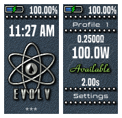
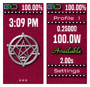
Paranormal Theme. Comprehensive menu system. All features included....i think ! Theres only really one way to do the 250C menus which incorporates all the different styles 250c offers.. TC, Wattage and Replay and i think this is it. I'm not a big fan of the icon style setting menus, you can't make great icons in a 20x20 space. With that in mind all of my themes contain exactly the same menu system and only the artwork differs. I am not even close to being an expert so i'm open to comments on how to make the menus better. Also if you have a request for the main lock screen icon that tailors to your favourite mod / atty i'm willing to give it a bash. include a colour too if that matters to you, i find darker themes with white menus work better.-
- 1
-

-
- paranormal
- 250c
-
(and 1 more)
Tagged with:
-

where do i down load 250c themes
SinisterCabbage replied to robert ferragamo's topic in DNA 250 Color
Ive just posted an untested one, you beta test it if you like ! its aimed at Paranormal though. -
Version 1.0.0
436 downloads
1st Attempt at a 250C theme. My Paranormal hasn't arrived from ecigone yet. so it's untested. I didn't change the working too much it's mostly an artwork project. Later attempts will probably try to utilise the massive amounts of options in eScribe. Let me know about bugs and stuff ill sort them quickly.-
- 1
-

-
- paranormal
- 250c
-
(and 2 more)
Tagged with:

